| Author |
Thread Statistics | Show CCP posts - 0 post(s) |

Oswald Rehnquist
1243
   |
Posted - 2014.02.15 04:30:00 -
[1] - Quote
Did this like 3 days ago, nothing special, just 20 mins
https://drive.google.com/file/d/0B7OdomK1wfBOOWFWTUhiTTNzTk0/edit?usp=sharing
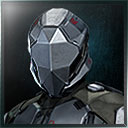
For caldari I included a very angular design which would fit the caldari theme. The blue on the HUD would be more transparent and the solid black is just part the visible part of the helmet to make it feel like you are looking out of something.
Gallente would have a lot of waves/curves in their design along with a sea green color, not sure how the amarr or minmatar would work pattern wise.
Having minor aviation experience, the extra aiming orientation along with the compartmentalization of info (plus the immersion) would be a cool thing to add in my book, but I don't know if people would find it too cluttering or frivolous.
Below 28 dB
|

Oswald Rehnquist
1244
   |
Posted - 2014.02.15 04:47:00 -
[2] - Quote
Patrick57 wrote:Amarr should be golden and look....royal, I guess. Minmatar should be brown and look like someone duct taped it together 
http://www.dartmouth.edu/~matc/math5.pattern/Critchlaw.31.gif
http://upload.wikimedia.org/wikipedia/commons/5/57/LiuboBoardDiagram.png
Here are some base ideas which I could base the other ones off on, minmatar could be boxy of sorts, the separation between gallente and amarr could prove interesting considering they both favor smooth designs.
Aisha Ctarl wrote:Your image is broken on mobile and on my laptop - just a broken image icon.
Well that's not good, it might require you to have a google account, I can see other people viewing it though
Below 28 dB
|

Oswald Rehnquist
1244
   |
Posted - 2014.02.15 04:51:00 -
[3] - Quote
Iron Wolf Saber wrote:I hope the light blue is just glass deformation. Either way +1
Again 20 mins, its very possible one is a shade off from the others as well, I had it all grayed out initially, threw in blue to fit caldari.
Was curious on the designs that should be used for the other three races, if you have any images I'd like to see them.
Below 28 dB
|

Oswald Rehnquist
1246
   |
Posted - 2014.02.15 05:14:00 -
[4] - Quote
Alaika Arbosa wrote:The Minmatar having only one eye camera makes me hope that it would look something similar to the POV of a Terminator.
Red, constantly active with intel, very crisp and digitized.
By design it couldn't have more info compared to the other racial HUD, and I am thinking an all red vision would obscure some of the detail on the screen, but if you are talking about a layout like these for the minmatar
Terminator Vision
I can see what I can do, in which case I might take some liberties and do boxes and circles while trying to keep the general dust outline integrity.
http://upload.wikimedia.org/wikipedia/commons/5/57/LiuboBoardDiagram.png
I do like how you threw out the terminator vision idea though, gives me something else to look at when making the other ones
Below 28 dB
|
| |
|